A cheeky, unofficial guide to Canvas pages
Transcript
Hello.
Welcome to my unofficial guide to campus pages.
Because this video is going to be very tongue in cheek, I'm going to be doing it in the guise of a cartoon character that looks a little bit like me. In this video.
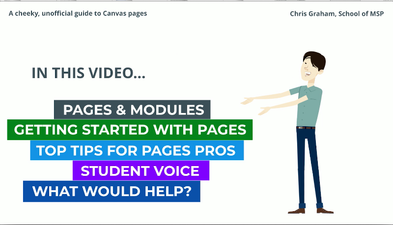
I'll be sharing my experiences using canvas pages and offering tips to both new and experienced users alike, including some you wouldn't hear from official sources while straddling a fine line to avoid my video getting squashed by the canvas team.
I'll finish off sharing some feedback from my students and thinking about how we can do more to encourage the use of pages.
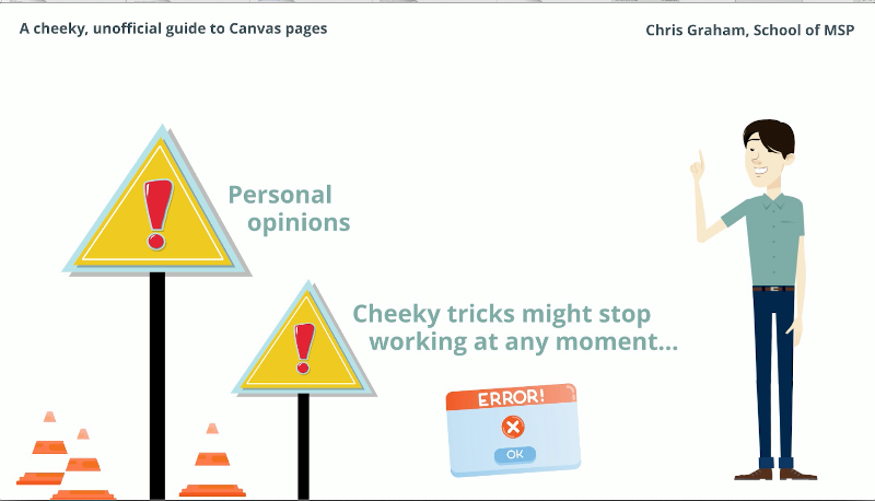
Warning. Strong opinions about Canvas follow and unofficial top tips can break without warning. That's just life on the edge. Also, you might have noticed I'm talking quite fast and will spout technical jargon later.
Visit this tinyurl for alternative formats, links and other stuff.
Before we go further, let me say that I am a big fan of Canvas.
I won't mention our old VLE, but I think it's fair to say that had we not moved to Canvas before online teaching, it would have been a real kick in the recaps.
Canvas basically has two ways of navigating around content:
Modules offer a listing of material like a directory, or pages can be used to navigate through content like a web site.
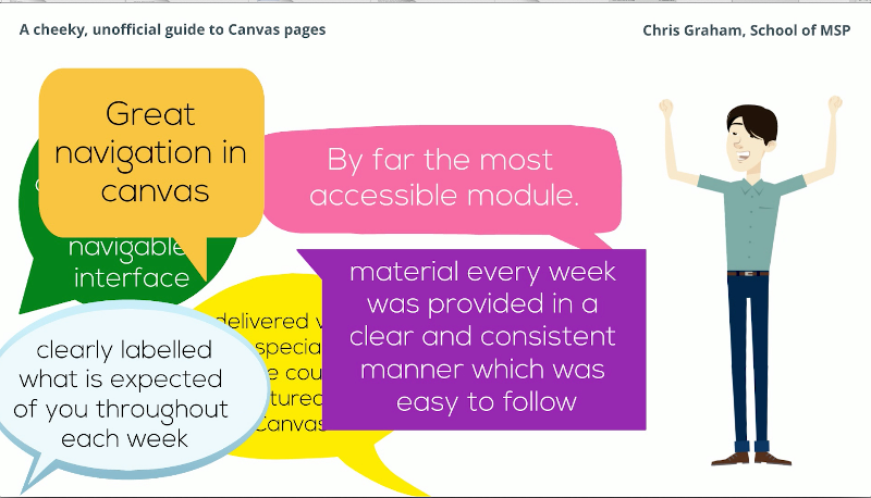
In case you haven't figured it out yet, the latter is very much my preference and has proven very popular with my students.
Now it may well be that I'm preaching to the choir here. And you, dear viewer, are not the person I need to convince.
In fact, I've seen some great use of canvas pages on LTDS courses, in modules I'm enrolled to in Canvas, for example, in Biomed, in some pages I recently saw in INTO.
In fact, probably great stuff going on all over the place.
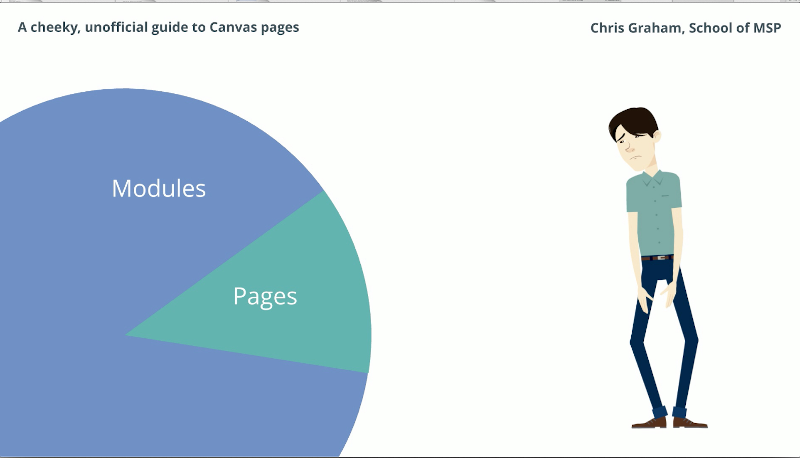
But I also see a lot of modules. I recently took a sample of courses from my own school and over 90 percent or courses exclusively use modules for navigation.
So what is my beef with the modules page?
Well, the presentation is very flat. Even if organised well, I don't think it is effective for establishing structure to a course.
Too often I see this used as a repository for files, often inaccessible PDFs with the key information buried deep inside.
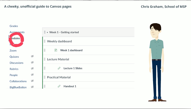
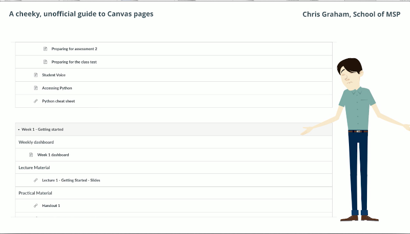
This is my modules page which I keep open for consistency with other courses in our school. And to quote a student from the feedback later, it's like scrolling through endless grey modules on one really long page.
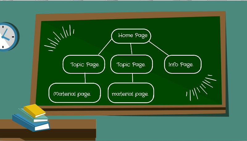
The idea behind using pages for navigation is that you write individual pages and then build a network that sits on top of your module items.
The way that I did this was to copy the style of the grid items in the Canvas blueprint and turn them into links to weekly content on my home pages in the same style.
Each link goes to what I call a weekly dashboard, which contains the week's video, objectives tick list, links to the individual material and a timetable for the week.
The teaching material itself is very similar to pages, but built in the Chirun software, which is a whole different talk.
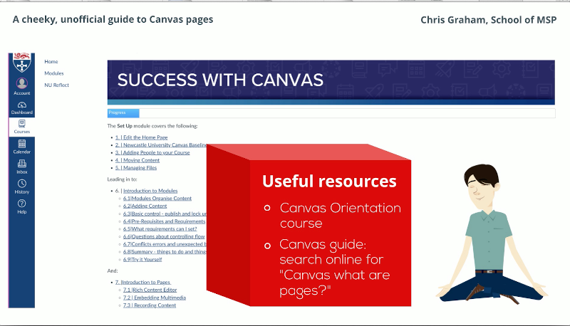
Pages don't need to be so fancy. This is the Canvas orientation course which uses regular links to connect pages together.
This is also a good place to come for info on writing pages. Here are some resources that I recommend.
Or why not give editing a page a shot? You can have tables, images, recap vids and much more using the rich text editor.
Note the course links button to connect up your pages.
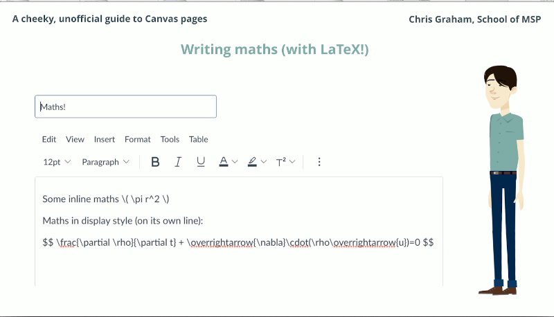
While we're in the rich content area, here's a quick tip for Mathsy people. You can add LaTeX right here in the text area.
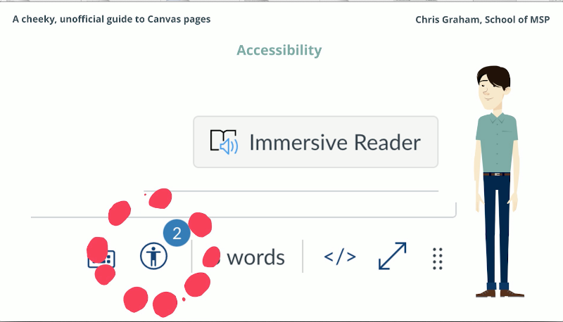
By writing pages, you're making more accessible content. Don't forget to check out some of the accessibility features: immersive reader and the feedback from Ally.
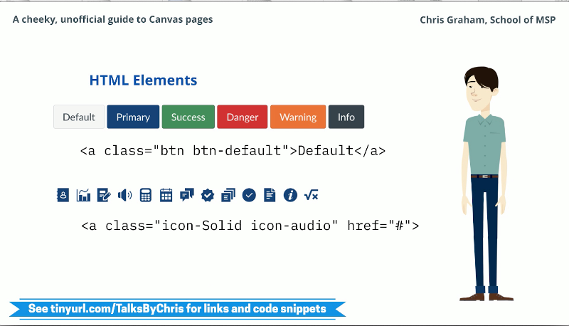
For more advanced use, we can switch the html view. There are a number of code snippets that you can paste into your page.
For example, many styles of buttons and nearly 100 icons. Progress bars as seen on the canvas orientation course and tabbed content can also be added.
But be warned that these don't look so neat on the Canvas mobile app.
One of the most handy pieces of html code is this (style="display: none;"), which is actually a CSS style. Because the Canvas html doesn't support normal comments to hide content. I use this to hold back material from my page template until it's ready to be displayed.
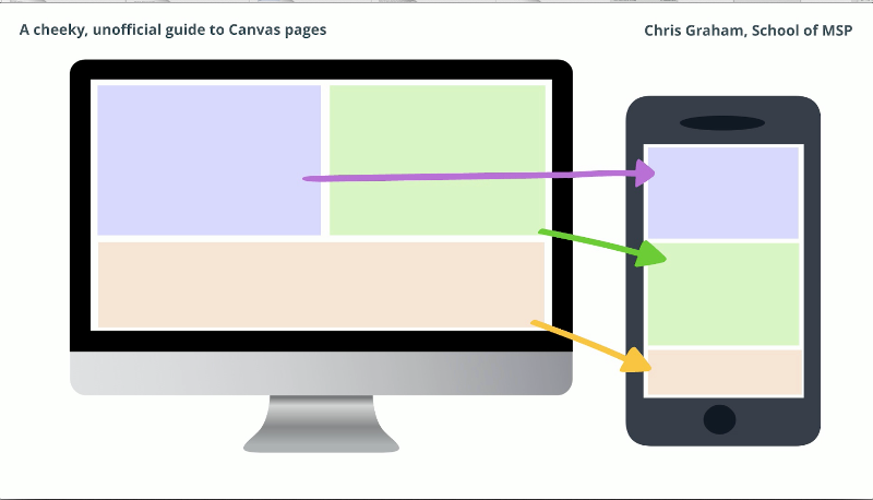
I like to use some of the grid features, Bootstrap style if you're familiar, which allow responsive layout of content to flow well on different devices. For code snippets for this and other features head to the talk link.
Final tip, you can embed all sorts in canvas pages.
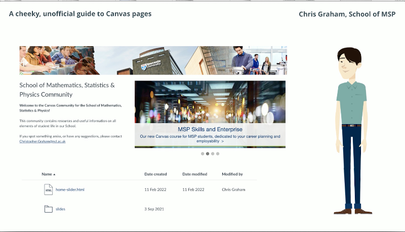
But did you know you can actually embed your own html with whatever styles and JavaScript by placing it in the files area of your course? I used this to create this slider on our canvas community. Since I have both the pages and modules navigation available on my course,
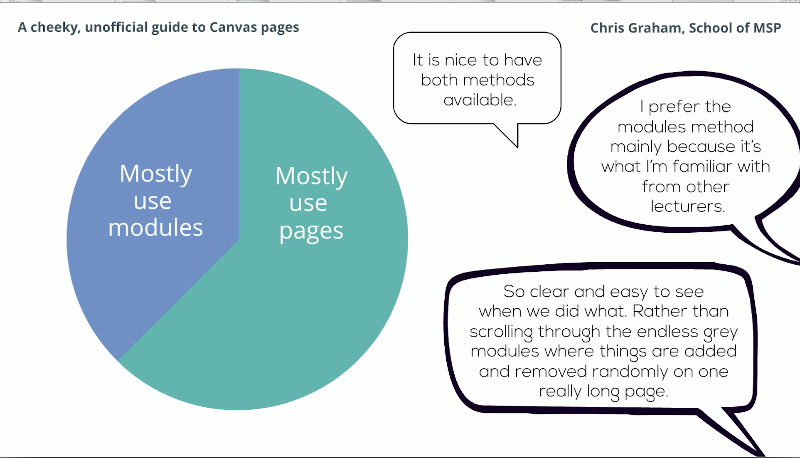
I asked my students which they use. More using the modules page than I thought, but maybe they're used to it.
They certainly appreciate having both options.
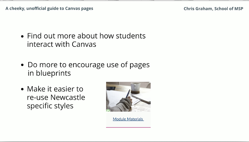
Finally, here are some things I think we should be doing.
Finding out more about how students are using Canvas. Thinking about encouraging more use of pages.
For example, there is an example page in the Canvas blueprint, but the module materials link on the home page goes to the modules view.
Maybe it shouldn't. And finally, a message for the Canvas decision makers: We could be making it easier for colleagues to reuse styles just like this one to give a more consistent experience. Canvas is pulling in a custom stylesheet for Newcastle, but we don't appear to be making use of it.
Well, I think I'm well and truly out of time, but thanks very much for listening. And if you'd like any more information, please see the link.