Histograms
Definition
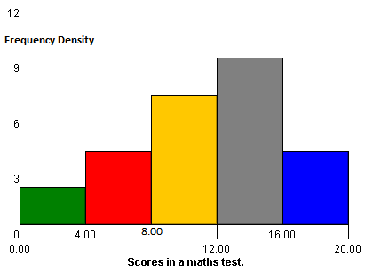
A histogram is a graphical representation of discrete or continuous data. The area of a bar in a histogram is equal to the frequency. The $y$-axis is plotted by frequency density (which is proportional to the frequency) and the $x$-axis is plotted with the range of values divided into intervals.
A histogram can only be used to plot numerical values and it is usually used for large data sets. It is useful for detecting outliers and/or gaps in the data set.
Worked Example
Worked Example
Construct a histogram of the following marks in a maths test where the maximum possible mark is 20. \[2,\ 4,\ 14,\ 14,\ 16,\ 17,\ 13,\ 16,\ 7,\] \[8,\ 9,\ 10,\ 11,\ 19,\ 18,\ 15,\ 15,\ 16,\] \[13,\ 12,\ 7,\ 8,\ 9,\ 12,\ 11,\ 18.\]
Solution
Firstly order your data so it will make it easier to group.
\[2,\ 4,\ 7,\ 7,\ 8,\ 8,\ 9,\ 9,\ 10,\ 11,\] \[11,\ 12,\ 12,\ 13,\ 13,\ 14,\ 14,\ 15,\ 15,\ 16,\] \[16,\ 16,\ 17,\ 18,\ 18,\ 19.\]
Next, look at your data and find the minimum and maximum values and choose a sensible class width.
Now you need to collect your data into a frequency distribution table.
|
Test Score |
Frequency |
|---|---|
|
$0-4$ |
$2$ |
|
$5-8$ |
$4$ |
|
$9-12$ |
$7$ |
|
$13-16$ |
$9$ |
|
$17-20$ |
$4$ |
This can now be plotted on a histogram.

|250px
Video Example
This is Khan Academy's video on creating a histogram.
Workbook
This workbook produced by HELM is a good revision aid, containing key points for revision and many worked examples.
- Descriptive statistics including work on histograms.
Test Yourself
External Resources
- Histograms at BBC Bitesize
